THE BIG PICTURE
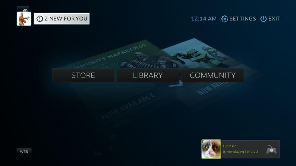
Right off the bat you will probably notice this layout. If you have launched Windows Media Center even once, you will immediately see a similarity. It is a user-interface that works very well, so it is not surprising VALVe decided to implement a similar design with Steam’s BPM, with a few refinements such as ambient music in the background.
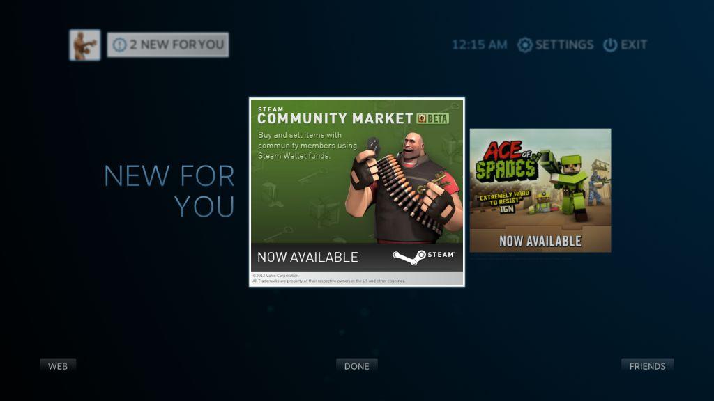
The “2 NEW FOR YOU” message refers to news and updates, be it from games you own or pre-release information This is a nice change from the pop-up updates that come after launching the normal Steam UI , or after exiting a game/application.
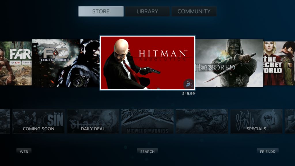
Moving to the Store tab first, we see a very nice layout, all categorized. It looks much nicer than the usual desktop UI, but overall presents less information/games due to having larger icons optimized for large-screen TVs.
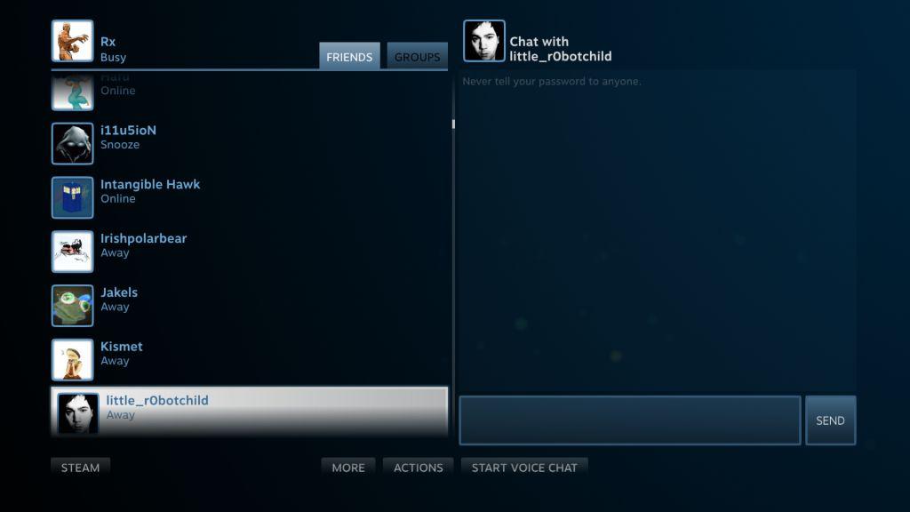
We will get to the Library, but let us focus on Community first. This is the usual area where you can manage your friends, groups, profile, and screenshots. Basically, anything related to the Steam Community is here. The chat menu is nice and large, but unlike the normal UI, there is no way that I could find to search friends by typing their respective usernames.
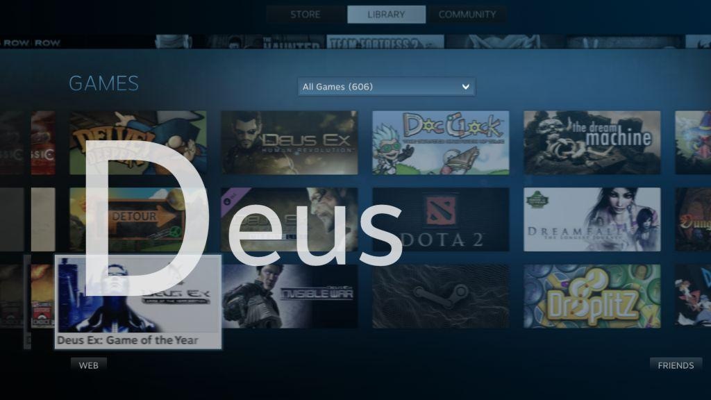
The Library on the other hand is where your catalog of games can easily be searched to quickly snap to the game you want to play:
 Technology X Tomorrow's Technology Today!


“The method on how this will happen leads me to believe that the Steam console will be based on cloud infrastructure ”
Sorry, but this is ridiculously stupid. Valve doesn’t play in the cloud-streaming game and that game isn’t ready for prime time.