Recently Microsoft unveiled the next version of its massively popular Windows operating-system: Windows 10. The oddly named successor to Windows 8 aims to bring back the familiarity of Windows 7, while still bringing something new and fresh to the table.
After the lukewarm reception of Windows 8, Microsoft is obviously attempting to distance the next version of their OS by skipping version 9 all-together. No doubt this is an attempt by their marketing team to make Windows 10 seem like a much larger step-way from Windows 8; telling users that all the problems that came with it are now fixed. But are they? Is Windows 10 really everything Microsoft claims? Today we’ll find out as much as we can about the future of the Windows platform as we go hands-on with the Windows 10 Technical Preview.
WINDOWS 10 TECHNICAL PREVIEW HANDS-ON
START MENU
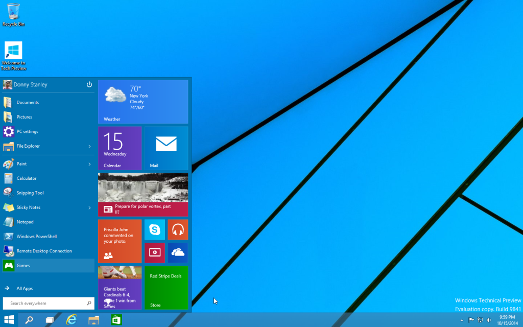
At first glance at the Desktop, everything appears largely the same compared to Windows 8. The only changes of note are the new Search and Task view buttons (more on those later). But once you click Start you’ll immediately see where 10 differs from 8.
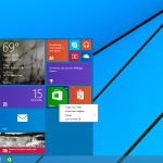
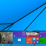
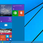
Yes… as promised Microsoft has brought back the much-loved Start Menu from Windows 7, however, things are slightly different this time around. As you can see there’s still plenty of Windows 8 here, and that’s a good thing.
The menu consists mainly of two separate panes, the left one being very reminiscent of the Windows 7 version; complete with Jump Lists, an All Apps view and of course the Search bar on the bottom. On top you’ll find the User info and a Power Options icon which allows you to Shutdown, Restart and all the other functionality you’d expect.
The right pane acts as sort of a mini version of the Windows 8 Start Screen; you can re-arrange tiles, resize them and pin any app you have installed. You can also adjust the height of the menu, giving you plenty of viewing options for different for screen sizes and resolutions.
Separate, all of the components that make up the new Start Menu are nothing new, we’ve seen Jump Lists and Live Tiles, as well as the ability to pin apps, but together they provide a whole new user experience, one that combines the best ideas of Windows 7 and 8, and provides the perfect balance between form and function.
WINDOW MANAGEMENT
Most users will no doubt be familiar Windows’ Snap View; a feature that debuted with Windows 7, which allows users to snap Windows to either the left or right side of the screen in-order to view two Windows side-by-side.
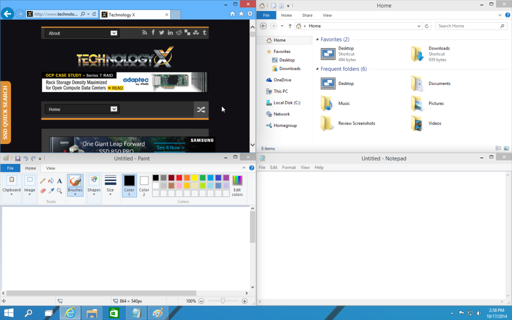
Windows 10 brings a variety of improvements to this feature that power users should find very useful, the most notable of which is the ability to view up to 4 Windows side by side, each snapped in their own corner of the screen. This is a huge improvement, especially with large 4K monitors becoming more common.
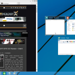
Another notable enhancement is when you have multiple windows open and you snap one to any portion of the screen, you’ll then be presented with a view of all other open applications. Clicking one will immediately snap it to the unused portion of the screen. This makes it much easier to quickly find and snap multiple Windows side-by-side.
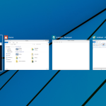
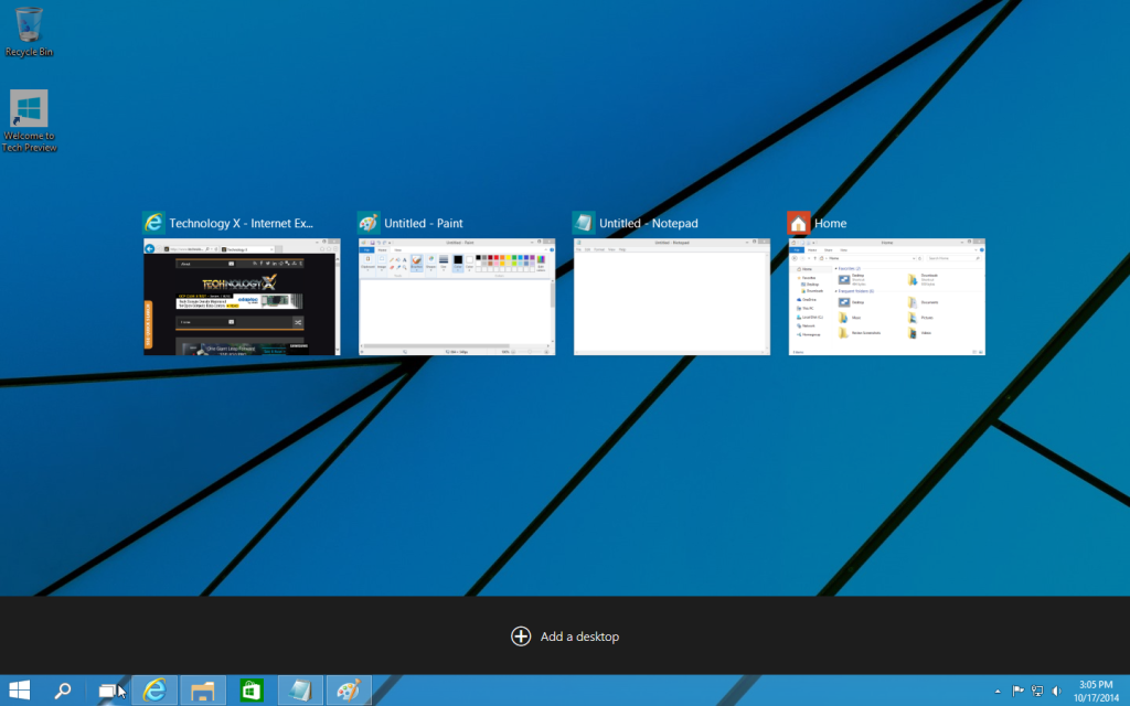
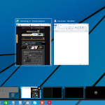
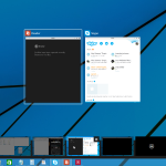
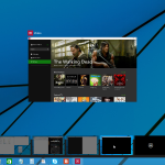
Alt -Tab view has also be redesigned. Instead of a rectangle box with small thumbnails of all running applications, users are now presented with a full screen overlay with much larger views of all open windows. This is another example of Windows 10 better utilizing larger higher resolution displays than previous versions have.
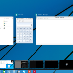
Clicking the Task View button we mentioned earlier, brings us to a similar-looking screen to the Alt-Tab view. Here, users are also revealed to one of the most exciting new features in Windows 10; Virtual Desktops. This new feature works sort of like having multiple monitors.
You can allocate different groups of applications in each Desktop, have them all pinned in different ways and switch between each of them easily, allowing you to interact with each of your work-spaces without disrupting the others.
If I had any gripes with this new feature it would be that I wish Microsoft would have gone even further with the Virtual Desktop idea – Allowing users to have different sets of icons and possibly even different wallpapers on each desktop would be very welcomed. The latter would not only be aesthetically pleasing but would allow users to easily and quickly distinguish between different work-spaces.
 Technology X Tomorrow's Technology Today!

